
A smarter way to budget together
Context
Solo project for Google UX Design Certificate
Role
Product Design User Research
Timeline
August - December 2025
Tools
Figma
This was my UX case study completed as part of Google’s UX Design Certificate program. I designed an app for collaborative budgeting — a tool that allows groups to track shared expenses.
I was inspired by my own experiences trying to manage group finances for trips. I noticed how easily confusion can arise when people contribute, spend, or plan at different times. I wanted to design a mobile app that makes these situations simpler, more transparent, and less stressful for everyone involved.
THE PROBLEM
Post-Spending Expense Splitting Creates Friction
When expenses are tracked after money is spent, people often forget details, contribute at different times, or interpret costs differently. This leads to confusion around who owes what and creates unnecessary tension. Instead of simplifying group finances, the process becomes stressful and prone to miscommunication.
How do we help groups proactively manage shared money, not just settle up after spending?
THE SOLUTION
A collaborative budget space
A collaborative budget space
An app where users propose expenses for the group and every member of the group gets to decline or approve.
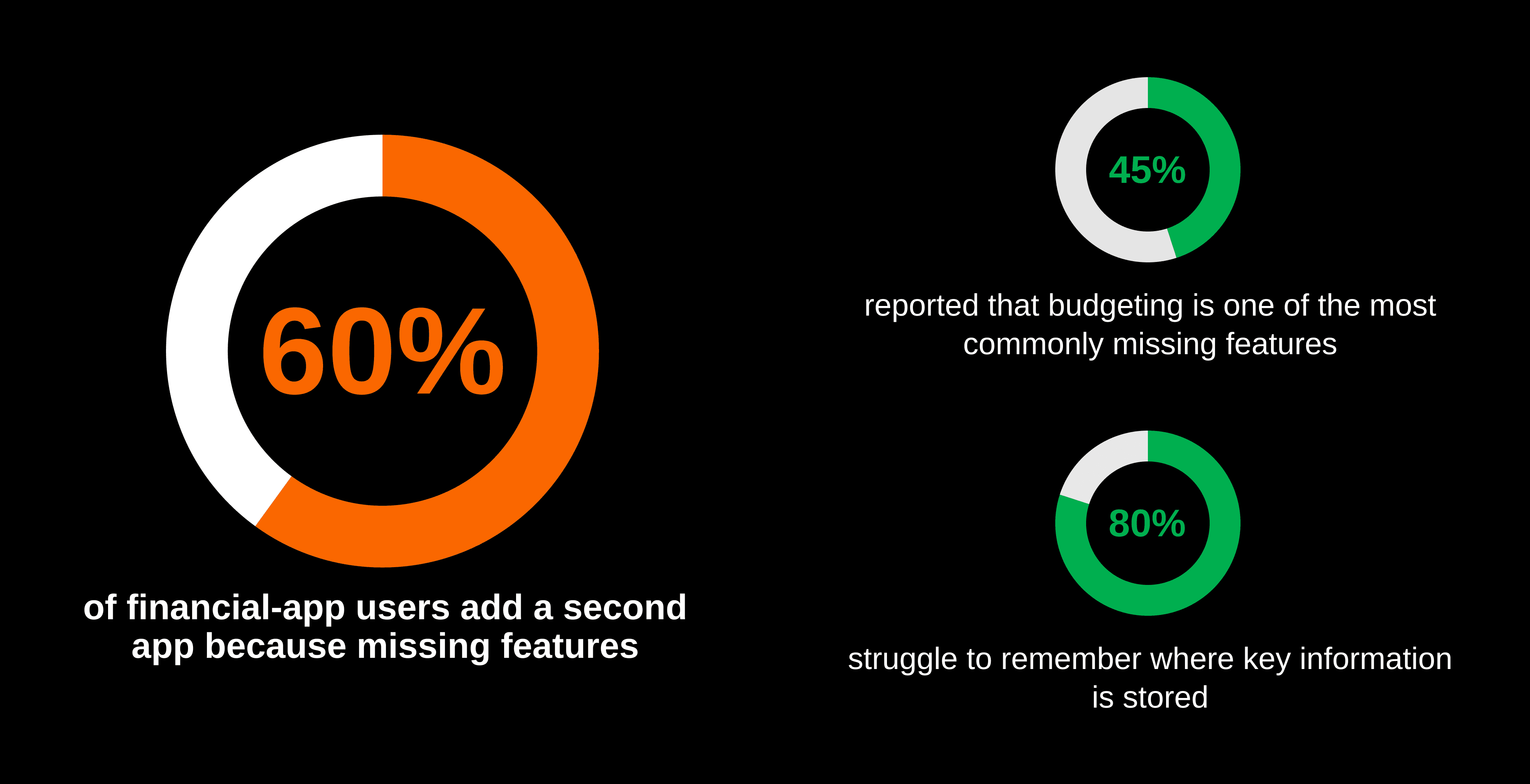
SECONDARY RESEARCH
Survey-Based Market & Behavior Insights
PRIMARY RESEARCH
User interviews
To better understand the challenges of managing shared finances, I interviewed six participants, including college students living with roommates and family members who share household expenses.
INTERVIEW QUESTIONS
When you share expenses how do you usually keep track of who paid for what?
What challenges have you experienced when trying to split or settle shared costs?
How does your group usually decide how much to spend on something?
If you could design the perfect way to manage group expenses, what would it look or feel like?
INSIGHTS
Key pain points in managing shared expenses
Synthesizing the interview revealed four key pain points in how people manage and experience shared expenses.
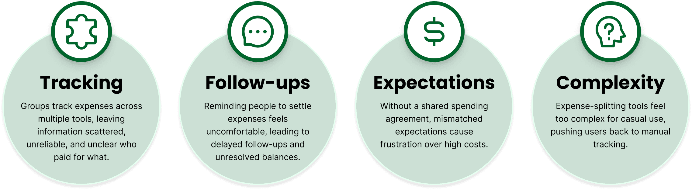
These pain points highlighted the need for a simple, shared system that aligns expectations and reduces friction in group spending.
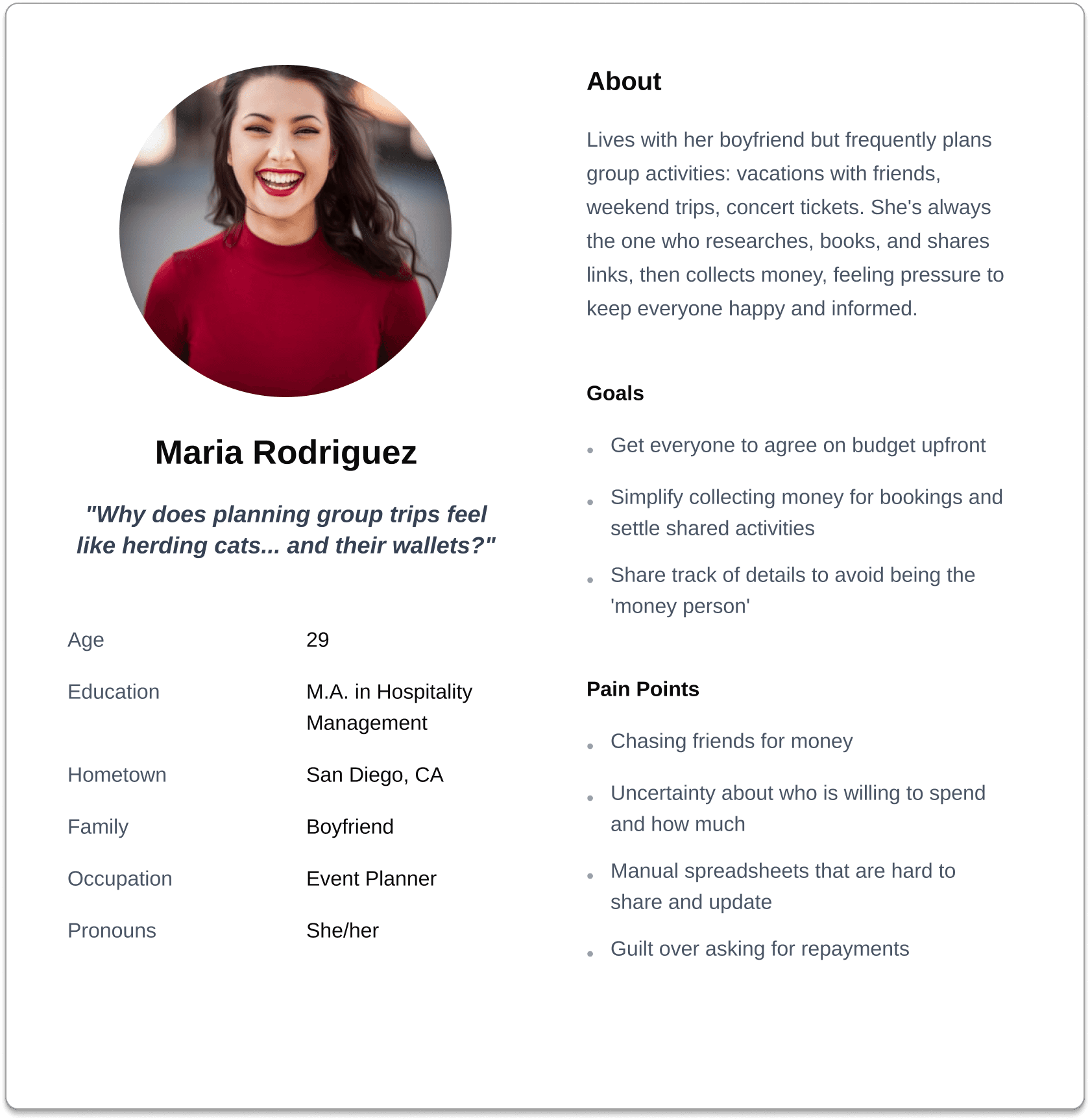
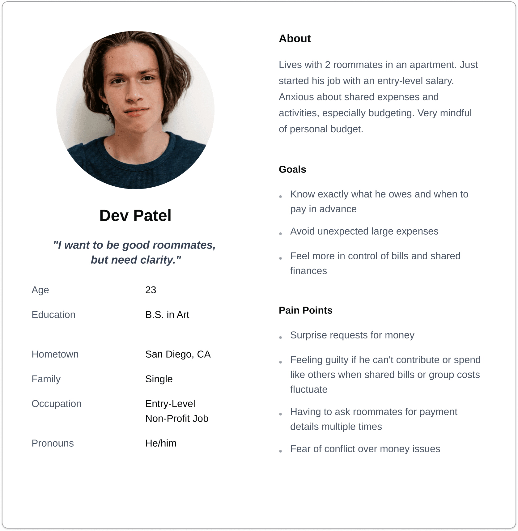
USER PERSONAS
Humanizing the data
I built user personas from interview insights to keep the design anchored in real needs. They reminded me that every choice supports people with goals, frustrations, and daily constraints.
COMPETITIVE ANALYSIS
Collaboration is missing in group budgeting
To better understand the market, I conducted a competitive analysis of 3 widely used collaborative budgeting apps, both direct and indirect competitors, using a detailed feature comparison spreadsheet.
Two goals guided my research:
Identify the core features that improve usability for group budgeting.
Identify why users find existing budgeting apps confusing and time-consuming.
View the competitive analysis here
TAKEAWAYS
The competitive analysis revealed what works in the current market and where existing apps fall short, highlighting clear opportunities to enhance my app.
My research revealed a key insight: Proactive planning, and collective decision-making before spending is crucial for groups sharing finances. Most tools prioritize settling costs over collaboration.
THE GAP
None of my competitors offer a way for groups to collaborate before spending
After identifying the market gap, I revisited the key pain points and personas I was designing for.
SITEMAP AND USERFLOWS
Before beginning designing, I used a sitemap to inform the structure of my wireframes and created a user flow diagram to illustrate the decision flow for approving or declining group expenses.
DIGITAL WIREFRAMES
My app’s value proposition is to simplify group budgeting. Research showed that users often find budgeting apps time-consuming and confusing, and that early bank linking could lead to high drop-off rates. To address this, I designed the onboarding process to do the exact opposite, making it simple, fast, and trustworthy.
TESTING
I turned my digital wireframes into a low-fidelity prototype and conducted moderated usability testing with six participants. During each session, I took notes on how participants completed each task. After testing, I synthesized my notes using affinity diagramming to identify common themes.
ITERATIONS
1 major improvement in my design
Usability testing revealed confusion between the budget and expenses sections. Based on this feedback, I refined the lo-fi prototype to make it more intuitive. Here are a couple of iterations that significantly improved my design.

Before
Users struggled to distinguish between Pending Actions and Budgets, often misinterpreting where a budget proposal belonged.
During testing, several participants attempted manage the budget they just created from the wrong section.
After
I consolidated all budgets into a single unified list and introduced filter tabs to separate states without splitting navigation.
This change aligned with users’ mental model of “one place to manage budgets,” while filters allowed quick segmentation without switching contexts.
As a result, users were able to locate and act on budget items more quickly with fewer navigation errors and less hesitation during task completion.
KEY TAKEAWAYS
What I learned
What is intuitive for me is not always for users
I thought the prototype was going to be clear for my users but the usability test revealed a different reality. This is why validation through testing is essential.
Being okay with letting go
Initially, I was excited to include many features, but creating user flows showed me how complex that approach could become. Based on user interviews, I learned that users already find budgeting apps confusing, so I shifted my focus to simplicity and core functionality.
Better questions, better insights
Some users gave detailed responses during the usability study, while others were more general. I learned to rephrase questions to gather more specific and meaningful insights.
© Laura Suarez 2025