

💭 Imagine you are in a group chat with eight of your friends planning a trip when suddenly Lisa books an Airbnb 🏡
No warning. The chat goes quiet…💥
Then the chaos starts!
💬 “Hey, can you send me your part?”
💬 “Wait… how much do I owe?”
💬 “Didn’t we agree on something else?”
The group isn’t struggling to split expenses. They are struggling to agree on them.
Well, that happened to me.

{ THE CHALLENGE }
{ THE SOLUTION }
01
A group member proposes an expense then the group votes in one shared space, ensuring every voice is heard before money is spent.
{ USER INTERVIEWS }
To move beyond my own experience, I conducted 6 user interviews with people who travel with family or friends. To synthesize research, I created an affinity diagram, mapping user quotes into themes.

{ ANALYZING COMPETITORS}
{ DESIGNING PHASE }
My initial idea was to separate the interface into Pending Actions and Budgets.
The goal was to help users prioritize faster.
Pending Actions included all of the proposals that were awaiting a vote, while Budgets contained all active groups.
The idea was to reduce cognitive overload and make the experience feel more actionable.
🤔 Well, that's what I thought…until I tested it further.

{ USABILITY TEST }
⚠️Testing revealed a mismatch between the product structure and users’ expectations.
Several participants attempted to manage newly created budgets from the Pending Actions section instead of Budgets section — suggesting that both areas communicated similar meanings to users. This confusion highlighted a need for clearer information architecture and stronger navigation cues.
{ ITERATIONS }
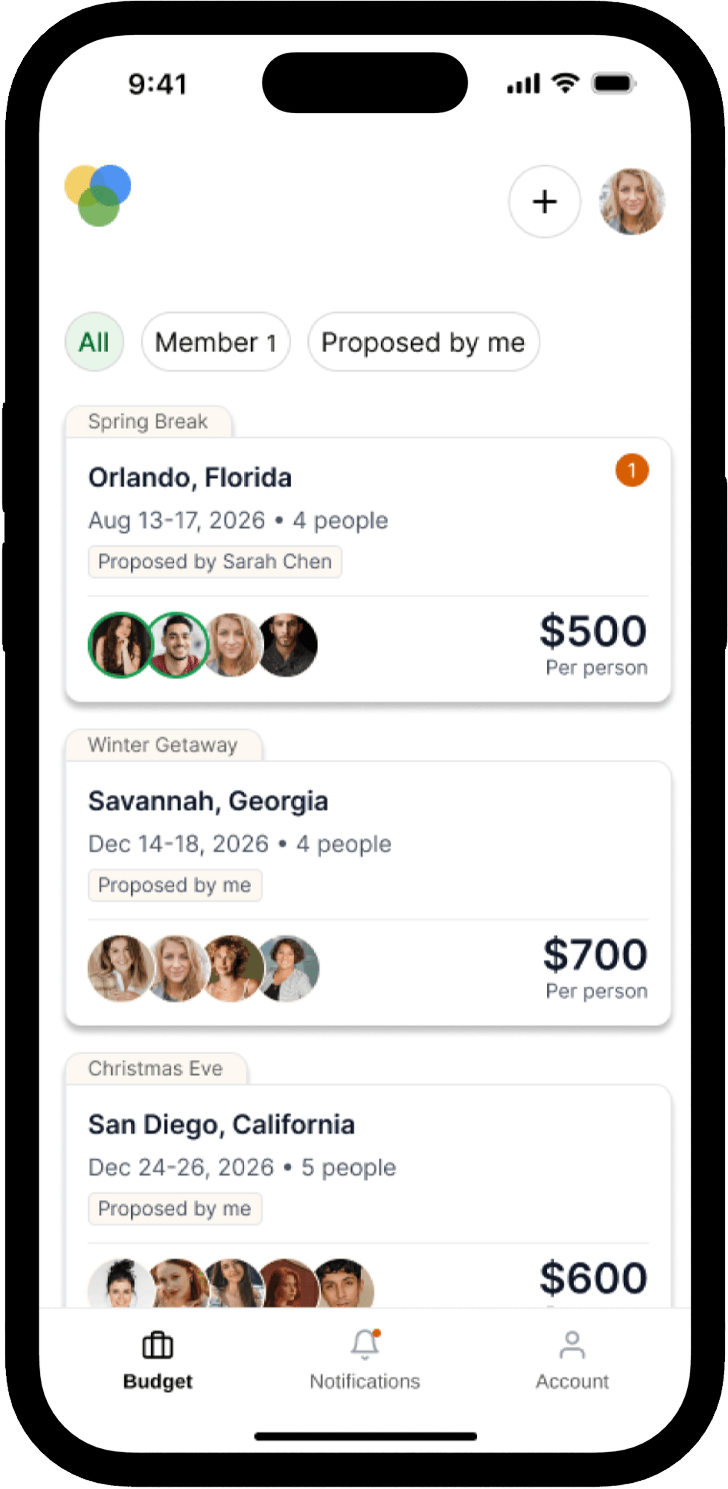
I consolidated all budgets into a single unified list and introduced filter tabs to separate states without splitting navigation.
This change aligned with users’ mental model of “one place to manage budgets,” while filters allowed quick segmentation without switching contexts.
As a result, users were able to locate and act on budget items more quickly with fewer navigation errors and less hesitation during task completion.
{ KEY TAKEAWAYS }
🧠 What is intuitive for me is not always for users
I thought the prototype was going to be clear for my users but the usability test revealed a different reality. This is why validation through testing is essential.
✂️ Being okay with letting go
Initially, I was excited to include many features, but creating user flows showed me how complex that approach could become. Based on user interviews, I learned that users already find budgeting apps confusing, so I shifted my focus to simplicity and core functionality.
🎤 Better questions, better insights
Some users gave detailed responses during the usability study, while others were more general. I learned to rephrase questions to gather more specific and meaningful insights.
© Laura Suarez 2025